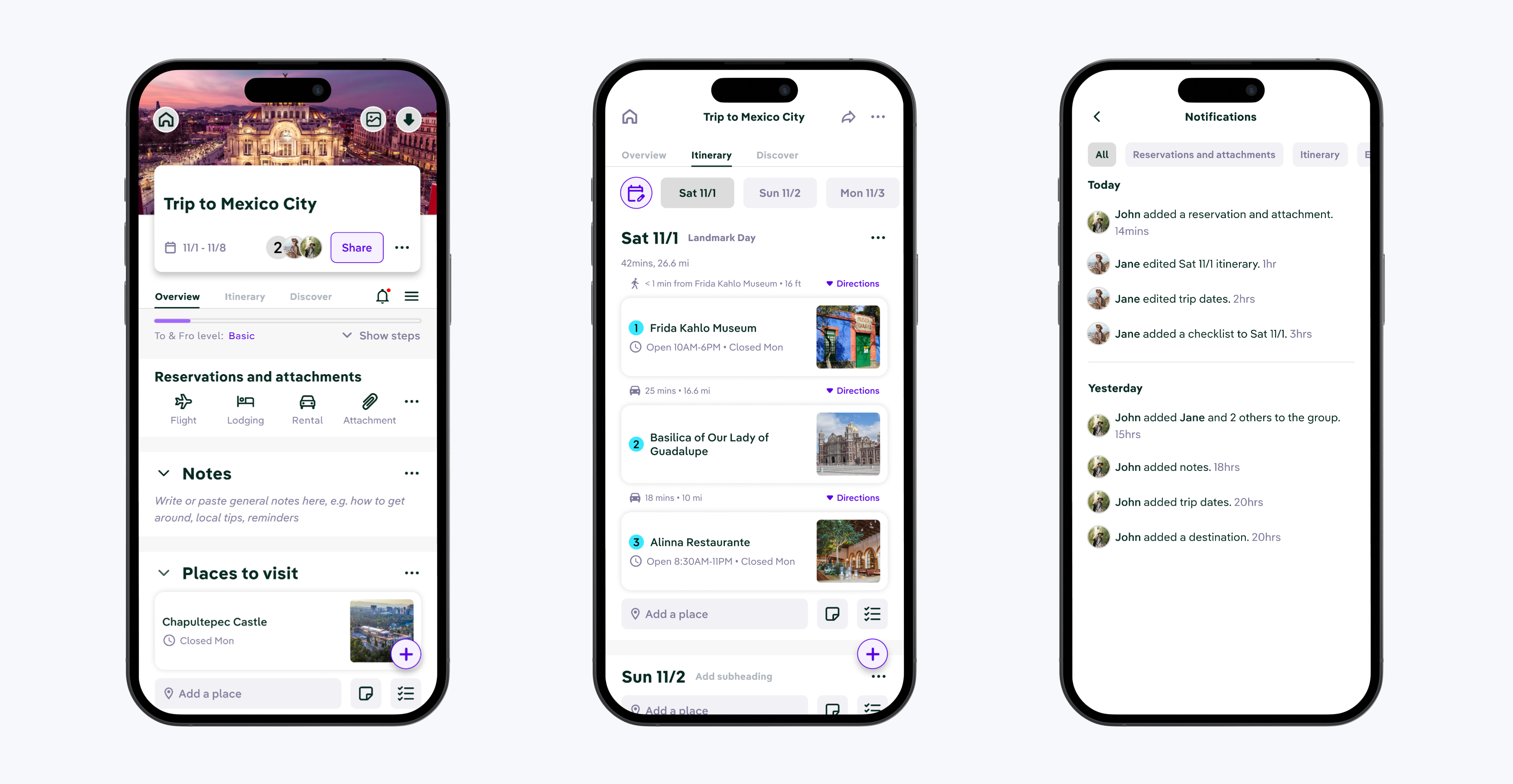
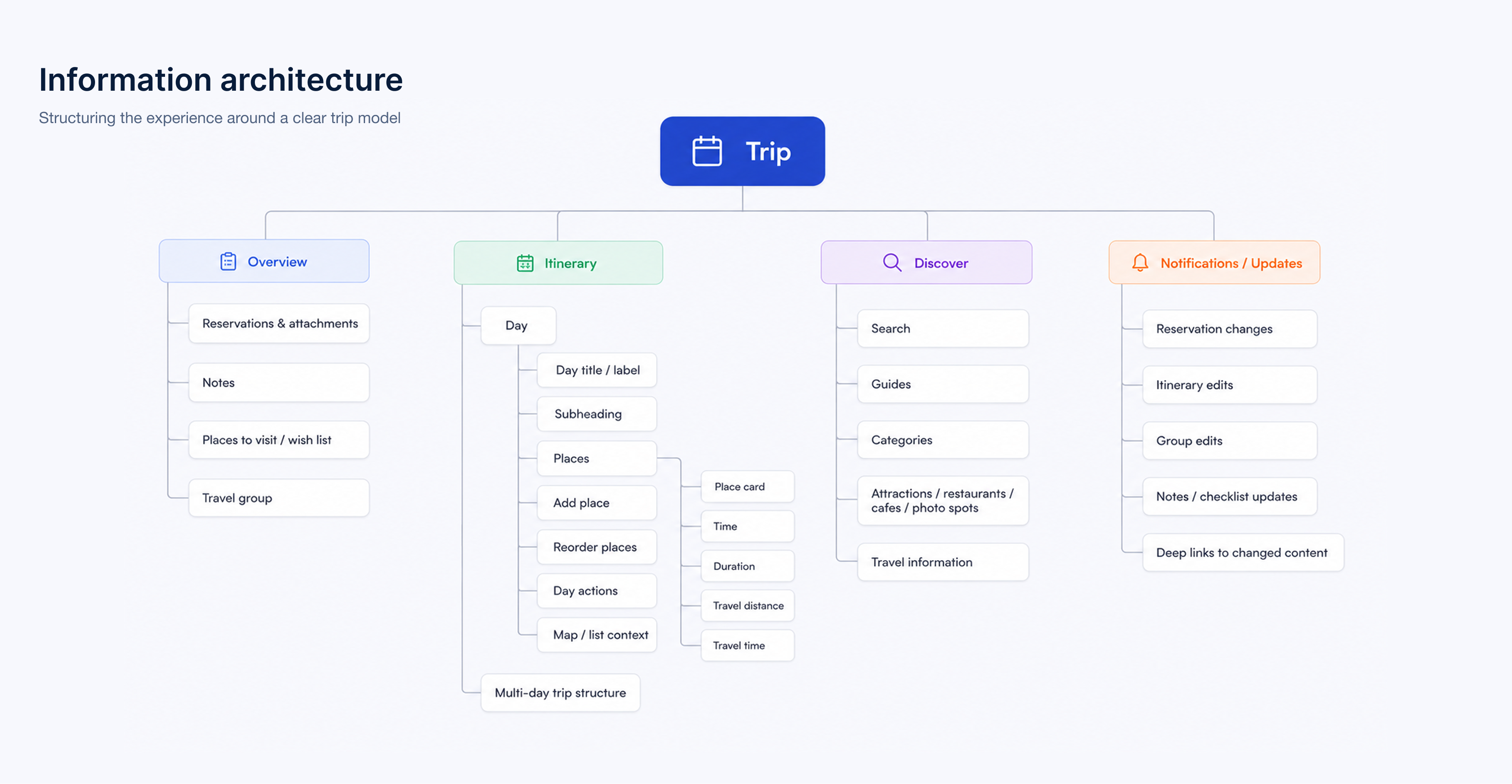
Building an itinerary feature from scratch

A trip-planning tool that helps travelers turn ideas into realistic, day-by-day plans

Startup
App
B2C
Travel

I. Project overview

Background
To & Fro is a collaborative travel-planning product built to help people discover, organize, and share trip plans more easily. My work focused on the itinerary layer — the part of the product where saved places stop being ideas and start becoming a real trip.

That mattered because itinerary creation was more than just another feature. It was the point where the product became truly useful.
Role
UX/UI, Prototype, Component/ Spec handoff, IA, Flows, Usability
Team
Product Managers, Dev Team, UX Writing Team
Timeline
2024 - 2025

Improving the To & Fro onboarding experience

Problem
Travelers had plenty of inspiration, but no clear way to turn scattered places and ideas into a realistic itinerary they could actually follow with others.
Goal
Design an itinerary feature that would keep users engaged in the app, make collaborative planning easier, and lay the foundation for shared and monetizable itineraries later on.

Solution highlights

Streamlined and intuitive
I designed To & Fro’s itinerary layer to help users organize trips by day, understand time and distance between activities, and coordinate plans with their travel group in a clearer, more structured way.
Provide "aha moments"
Helped users grasp key features early to boost satisfaction and confidence.
Gamify experience
Added a simple onboarding checklist with progress indicators to motivate completion.

Reduced Time to Value by 40% and increased onboarding conversion rate by 70%

II. Discover

An existing research foundation

What I found
Before I joined this work, To & Fro’s previous UX research team had already conducted interviews and white-paper research. That work helped uncover a niche opportunity in the travel space and define key personas for the product.

I built on that foundation by journey mapping those personas and focusing specifically on where travel planning broke down.

I learned that the issue wasn’t that users lacked places to go. It was that planning remained fragmented, unstructured, and difficult to coordinate.

People could collect ideas, but turning those ideas into a realistic day-by-day plan, especially with other people involved, was much harder.

Why these insights mattered

An opportunity...
This insight mattered because it created an opportunity that could be the product’s activation moment. If users couldn’t confidently build a plan, they were unlikely to stay engaged, return, or share their trip with others.

That made this discovery a retention problem, a collaboration problem, and a business opportunity all at once.

III. Decide

Define

Key insights
Three insights shaped my approach:
1) Planning lacked a source of truth
Users were often juggling notes, saved places, screenshots, and conversations across multiple tools.
2) Coordination was harder than collection
Saving places was relatively easy. The real friction started when users had to organize those places into shared, realistic days.
3) Users needed confidence, not just flexibility
A powerful travel tool only works if people feel confident using it. Too much freedom without structure can make planning feel heavier, not easier.

Prioritize

Why I prioritized itinerary
After going through a workshop with PMs and developers, I came out with a few ideas for how to address the pain points travelers are currentl experiencing.

Out of all of them, I prioritized the creation of an itinerary because it sat at the center of the product’s value. It was the clearest bridge between discovery and action, and the feature most likely to influence retention, sharing behavior, and future monetization.
Decision criteria
I evaluated design directions against four criteria:

• user value — would this help travelers plan and align more easily?
business value — would this benefit the product and the business model?
feasibility — could this work as a scalable foundation for future planning features?
MVP focus
I focused on the core itinerary experience:

• structuring trips by day
• adding and reordering places
• understanding duration, distance, and travel time
• supporting clearer coordination across a travel group

I intentionally did not focus on more advanced layers like auto-routing, AI auto-fill plans, or expense planning, because the core need was first to make itinerary creation understandable and useful.

With that in mind, I laid out the foundation for the information architecture.

IV. Design

Creating structure from nothing

Concepts of a plan
One of the first design challenges was helping users move from an empty state to a real plan.

I needed the experience to answer a basic question immediately:
What does “building an itinerary” actually mean here?

So I designed the feature around days as the core organizing unit. Instead of asking users to think about everything at once, the system helped them plan one day at a time.

That made the feature feel more approachable and reduced the mental load of planning.

Building realistic days

A working plan
Once the structure was clear, the next challenge was helping users create days that felt realistic.

To support that, I designed each day view to include:

• activities in order
• duration of each activity
• travel distance between stops
• travel time between stops

This turned the itinerary into more than a list of places. It became a planning tool that helped users judge whether a day actually made sense.

Supporting coordination and collaboration

A shared plan
The hardest part of the problem was not collecting destinations, it was aligning on what was actually happening, when, and in what order.

So I designed the itinerary to support shared understanding:

• what is happening on each day
• how long those plans will take
• how movement between activities affects the day overall

This gave travel groups a clearer source of truth and reduced the friction of planning across multiple people.

V. Validate

What I wanted to learn

Evaluating usability and effectiveness
I centered validation around one core question:

Could users take saved ideas and turn them into a clear, coordinated itinerary without extra guidance?

Because this was a brand-new feature, I wasn’t just evaluating usability. I was also testing whether the itinerary model itself made sense to people — whether they understood how to go from inspiration to a realistic plan.
Example tasks
To evaluate that, I focused on tasks that reflected the feature’s core value:

• create the first day of a trip
• add multiple places to that day
• reorder activities into a realistic sequence
• understand the duration of the day and the travel distance between stops
• explain how the itinerary could help coordinate plans with other travelers

These tasks helped me assess both basic usability and whether the feature was actually helping users plan in a way that felt useful and collaborative.
Testing results
Initial testing projected the following metrics:

92% of users built a day

users successfully built a first itinerary day without assistance in testing

1.8x more likely to return

users who built an itinerary were more likely to return than those who didn't

4/5 confidence rating

planner confidence after completing a first day

Impact beyond metrics

A powerful planning tool
Beyond the numbers, the itinerary feature gave To & Fro a stronger product center of gravity.

It moved the app beyond inspiration and into action. Instead of simply collecting ideas, users could start turning those ideas into something real.

That mattered for users because it made planning feel more manageable and collaborative. It mattered for the business because it created a stronger reason for users to stay in the product, return to it, and eventually share what they built.

Just as importantly, it laid the foundation for future product behaviors the business cared about most: itinerary publishing, social sharing, and long-term monetization.