Two sprints before next playtest; limited settings controls
What's the problem I tried to solve?
Problem
Playtests revealed key issues: settings didn’t match player mental models, labels lacked clarity, and effects felt unpredictable. This misalignment caused confusion, friction, and trial-and-error. Players also expressed a strong need for deeper customization controls to tailor gameplay to their needs.
Goal
Redesign the settings experience to align with player mental models, provide clear and predictable feedback, and introduce meaningful customization so players can tailor gameplay to their needs with confidence.
Solution: Impactful settings menu
Match mental models with reality
Align mental models with real changes made in game, so there is no misunderstanding or disconnect.
Customization controls
Add accessible settings options that allow players to tailor gameplay to their unique playstyle and accommodate any accessibility needs.
90% increase in user comprehension and satisfaction with gameplay controls
II. Discover
Focus group
Empathizing
First, I needed to understand the problem in players’ words. I ran a focus group with 6 players to capture needs, preferences, and pain points. Because time was tight, this let me surface patterns quickly and hear people build on each other’s experiences.
Key findings
Research revealed the old menu lacked detail, feedback, and accessibility controls.
Lack of context around settings
Players expect menus and settings to match how they naturally think about organizing and accessing features — this is their mental model.
In the existing menu, the behavior of settings didn’t align with those expectations. That mismatch created confusion, friction, and unnecessary trial-and-error.
Absence of customizable settings
Overall, players expressed a strong need for more customization options, especially for HUD, subtitles, and button controls.
III. Ideate
Wireframing and thought process
Reimagining the settings menu
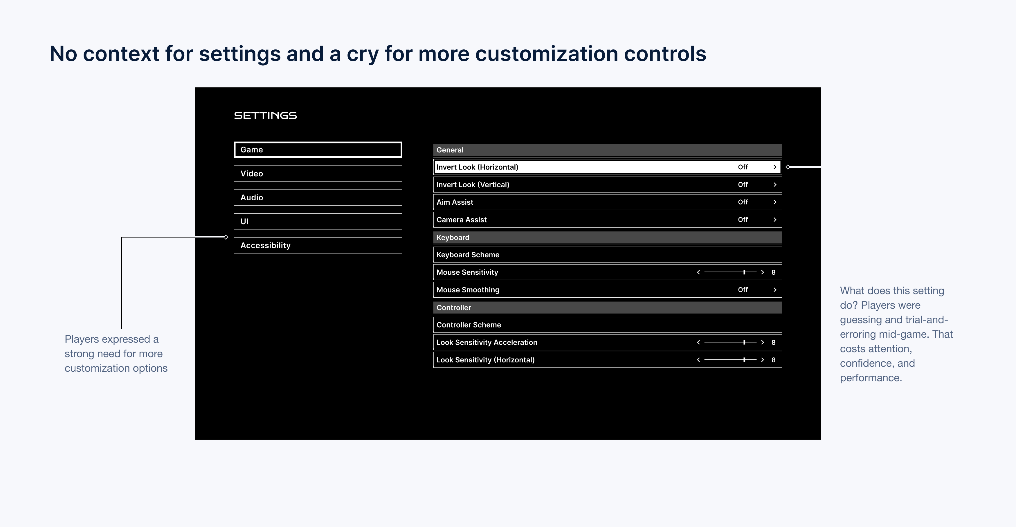
My first attempt at the menu design lacked context for settings and customization. Players were guessing and trial-and-erroring mid-game. That costs attention, confidence, and performance. I also needed to add more customization controls to allow for an accessible gaming experience for all.
So I came up with the following HMW questions to frame my design process.
How might we provide more context to settings?
How might we incorporate accessibility and customization?
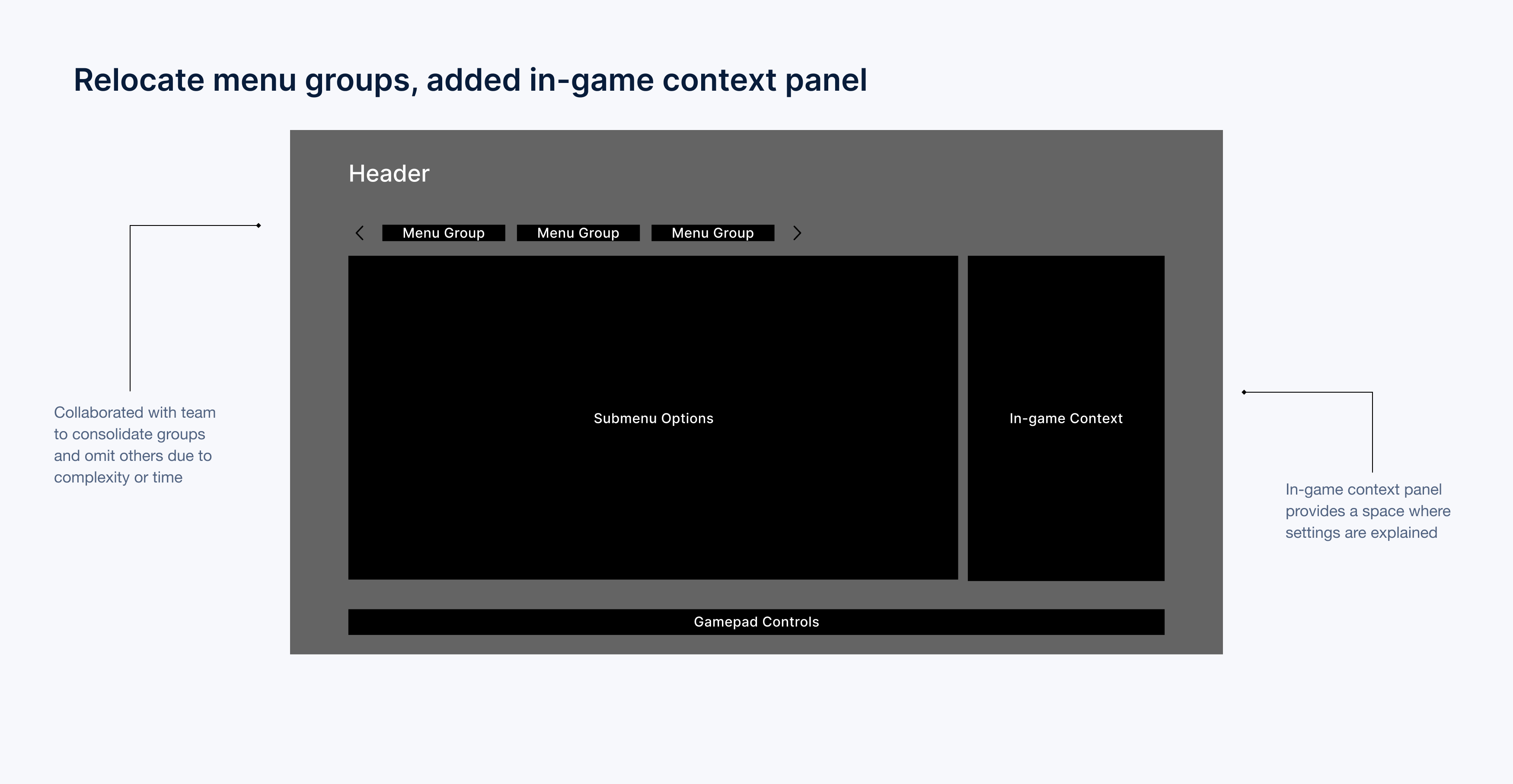
A new panel in the menu
I added an in-game context feature that displays descriptions, images, or videos when players hover over submenu options, showing how settings affect the game. To avoid cognitive overload, I moved the menu groups to the top since there were only three, offering a clear and seamless way to understand settings controls without overwhelming users.
New addition
In-game context
The in-game context panel is a new addition to the menu. It informs players of the impact their settings will have in-game, eliminating the need to exit the menu to see how their gameplay is affected.
Visual comparison
Original vs redesign
A comparison of the original menu design with my redesign, supported by user research.
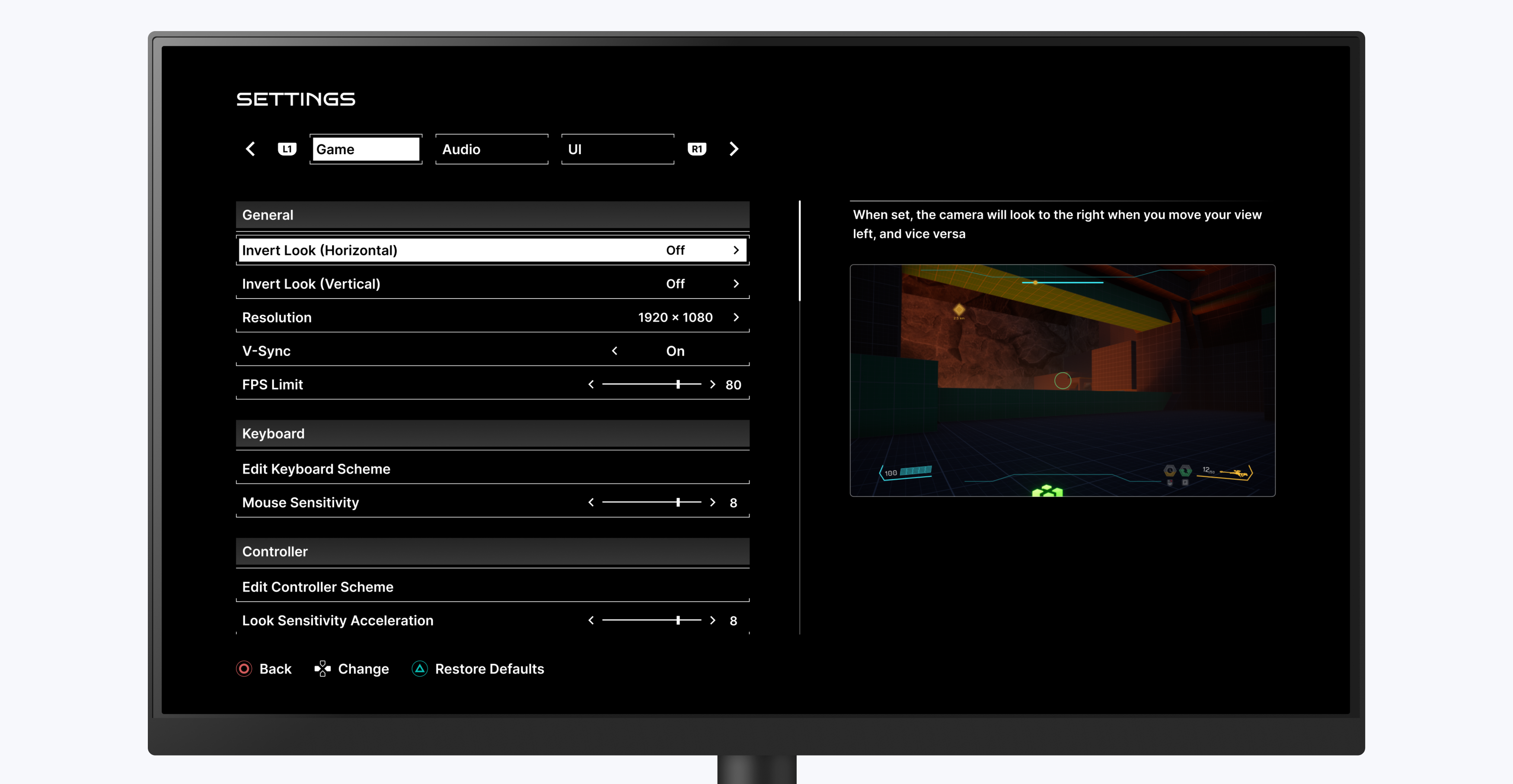
Original
Redesign
IV. Design
Adressing the no-context issue
Aligning mental models with reality
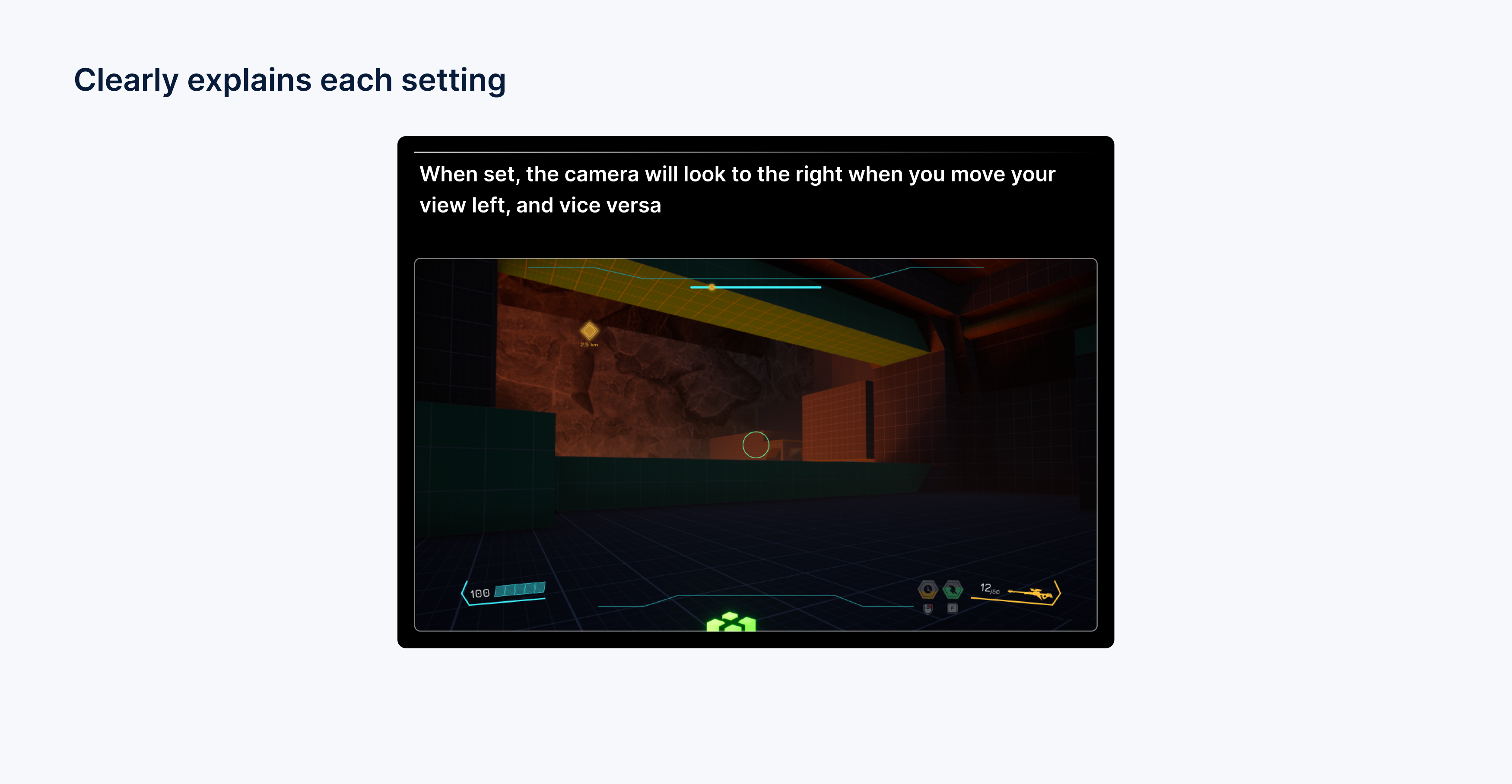
Here’s a concrete example. When a player hovers or focuses Invert Look (Horizontal), they get a short description plus a visual preview of how camera motion changes. That empowers informed decisions—recognition, not guesswork—and the interaction stays quick.
Additional accessibility features
Improving overall UX
After adding the in-game context panel, I pushed for more features in the game settings to improve overall UX for users. Here are some of those additional features:
Subtitles and readability
I pushed accessibility improvements into the base design: adjustable subtitle size, a backing so text stays readable on any background, and speaker labels so you always know who’s talking. Critical for low-vision players, noisy environments, and anyone playing without sound.
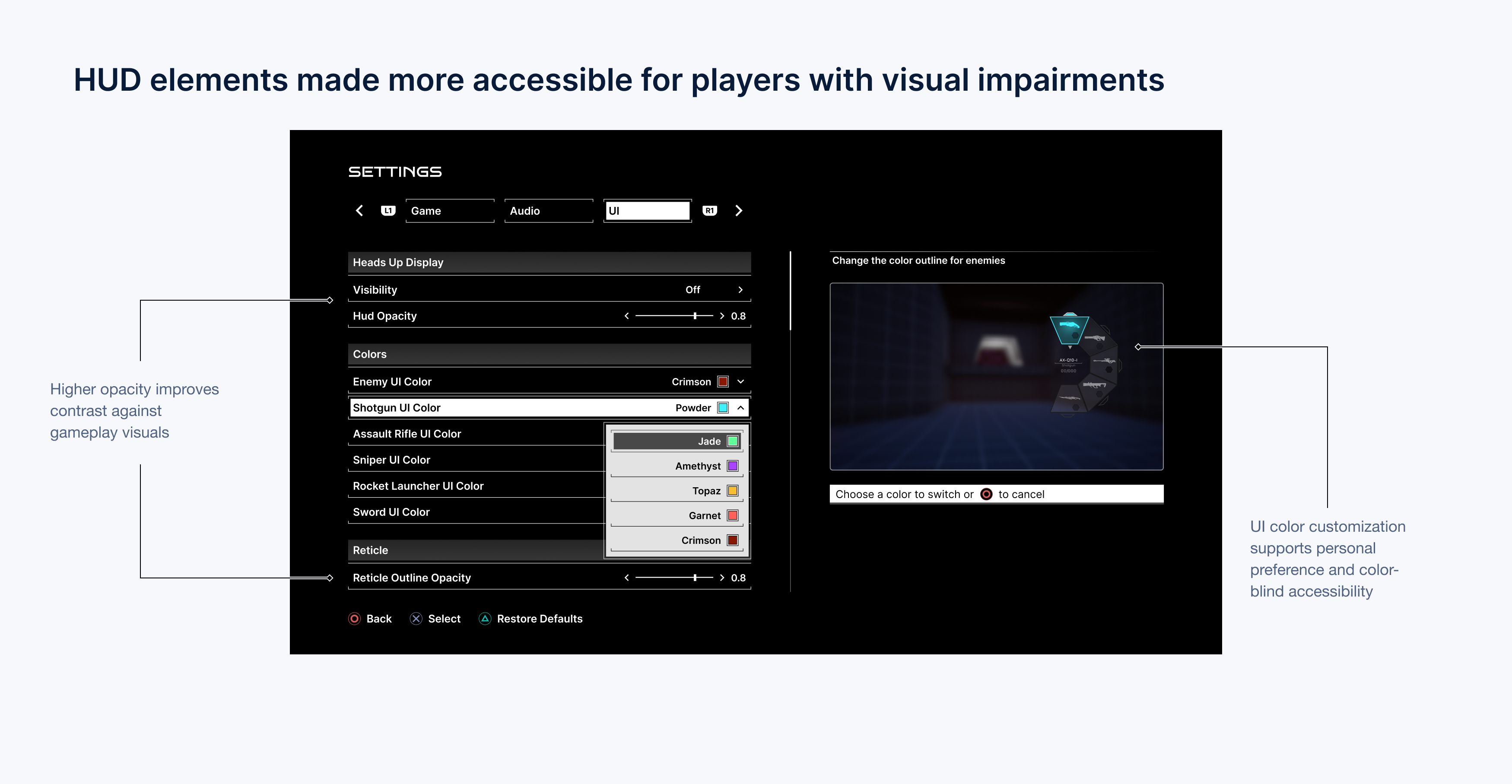
HUD personalization
I also added HUD customization for key elements. Letting players tune visibility and placement supports different visual needs and boosts immersion by giving control where it matters.
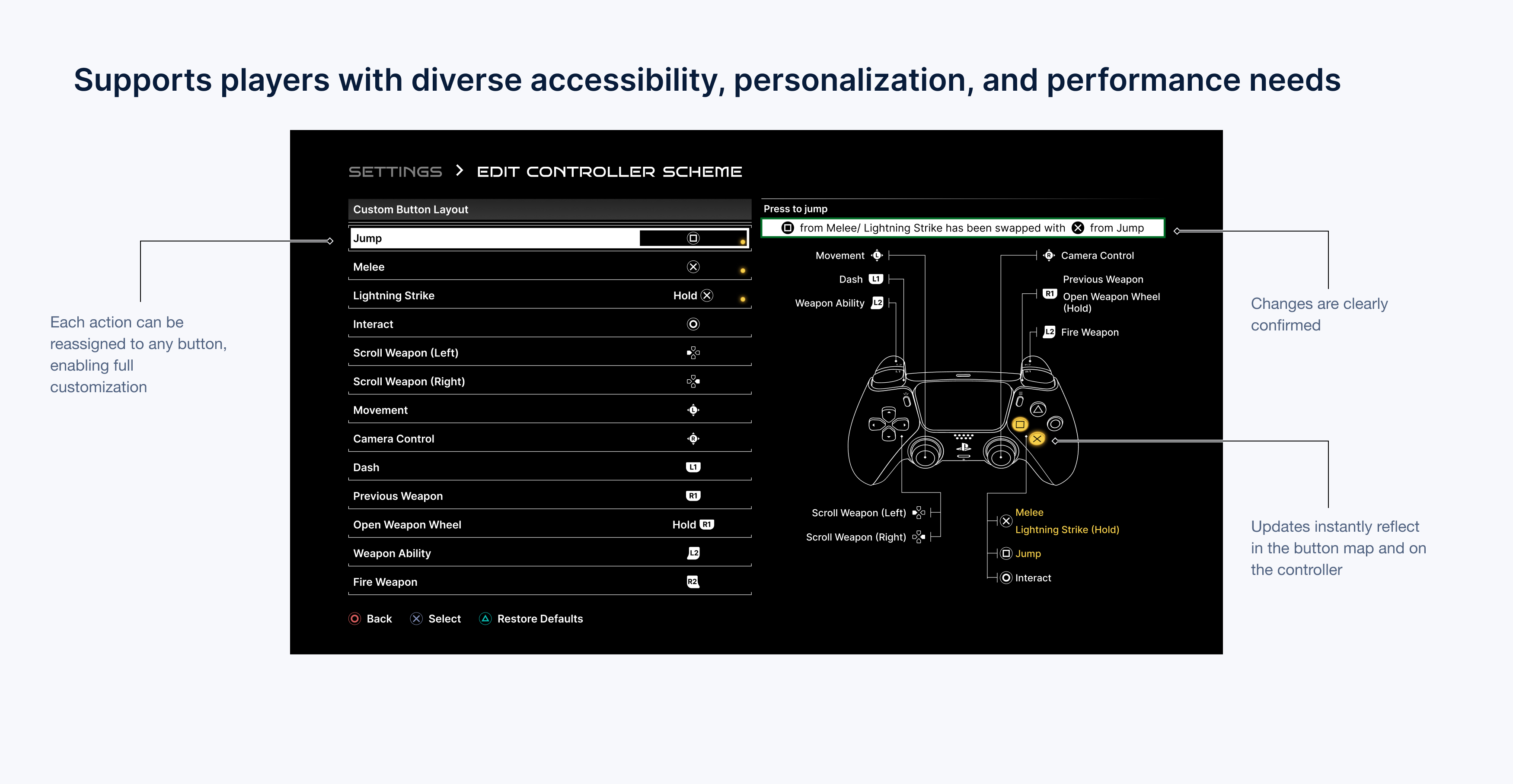
Remappable controls
Finally, button remapping before the playtest. It supports diverse motor patterns, comfort, and performance—small change, big impact on playability and satisfaction.
V. Outcomes
Initial impressions
Received well by users
User feedback made it clear: the settings menu was well-received. Players appreciated the redesign and the new additions to gameplay controls.Here are a few quotes that stood out to me:
“These are some of the slickest settings I’ve seen in a game” - user
“I like how much control you have over your gameplay” - user
Moderated tests
Improvement in comprehension and increased satisfaction
Through moderated tasks, comprehension rose ~90%. Alongside that, qualitative feedback trended positive on control and clarity.
90% increase
in settings comprehension
Increased satisfaction
feedback trended positive
5/5 rating
by users for ease of use
What I learned
Takeaways
• Avoid guessing: Even a short, clear description helps users understand what a setting does.
• Design for all knowledge levels: Don’t assume every user has the same experience—always provide context.
• Show and tell: Pair visual cues with text to help users make confident, informed decisions.