Conveying quick value

Reducing time to value and improving conversion for an onboarding process

Startup
App
B2C
Travel

I. Project overview

Background
To & Fro is an innovative travel planning tool that streamlines the collaborative trip-building experience. It enables travelers to discover destination insights, share detailed itineraries, and organize group trips — all while preserving the authenticity of travel.

I joined as a UX/UI Designer to enhance the mobile experience, with a key focus on improving the onboarding flow.

My mission: build trust, simplify first steps, and accelerate time to value.
Role
UX/UI, Prototype, Component/ Spec handoff, IA, Flows, Usability
Team
Product Managers, Dev Team, UX Writing Team
Timeline
2024 - 2025

Improving the To & Fro onboarding experience

Problem
New users were either not completing onboarding or getting overwhelmed by To & Fro’s rich feature set. The complexity caused hesitation, frustration, and ultimately churn.
Goal
Come up with a way to simplify the onboarding experience, guide users to quick wins, and improve adoption and conversion rates.

Solution highlights

Streamlined and intuitive
Consolidated screens and reduced friction across the experience.
Provide "aha moments"
Helped users grasp key features early to boost satisfaction and confidence.
Gamify experience
Added a simple onboarding checklist with progress indicators to motivate completion.

Reduced Time to Value by 40% and increased onboarding conversion rate by 70%

II. Discover

Reviewing the old flow

Empathizing
User feedback made it clear: the onboarding flow felt unpredictable, overwhelming, and confusing. Users didn’t trust the experience and were unsure if they had completed the necessary steps to get started.

Here are a few quotes that stood out to me:

"I wasn’t sure if I finished setting up — it just sort of... ended."
- user

"I didn’t trust it with my trip planning after the weird sign-up."
- user

Hypothesizing and evaluation
I believed that unpredictable navigation, lack of system status, and overwhelming information architecture were key drivers of drop-off. Without quick value realization, users lost interest and churned.

I also did a quick UX evaluation of the old flow. Here are some of my notes.

Understanding the problem

Insights
I set out to deeply understand users' needs and frustrations.

By analyzing insights from user interviews and affinity mapping key patterns, I identified the core problems and uncovered where improvements would have the greatest impact.
Inconsistent experience
The visual and interaction design between signup and the main feed felt disconnected, breaking trust.
No visibility of system status
Users didn’t know how far along they were during signup, causing uncertainty and hesitation.
Unsure where to start
Landing on the feed after signup felt like being dropped into a new city without a map.
Unawareness of product value
Without a clear explanation of core benefits, users couldn't see why To & Fro was worth their time.

III. Decide

From insights to user stories

A direction
After mapping user pain points, I distilled them into user stories that highlighted what users needed most.
Opportunities to focus on
These stories led directly to key features: a consistent onboarding experience, visible progress indicators, and faster value realization—all designed to reduce friction, build trust early, and accelerate adoption and satisfaction.

Narrowing solutions

Jobs-to-be-done microsurvey
Initially, I suggested adding a microsurvey to personalize onboarding based on user goals. It would have been powerful for tailoring experiences, but when checking in with engineers, they revealed it would ultimately be too complex for a quick fix.

❌ Did not pursue.
Onboarding checklist
I pitched a focused onboarding checklist: short, actionable, and motivational.

Instead of overwhelming users, this checklist would celebrate small wins and guide users to meaningful engagement faster.

✅ Identified a feasible solution.

IV. Design

Reveal product value faster

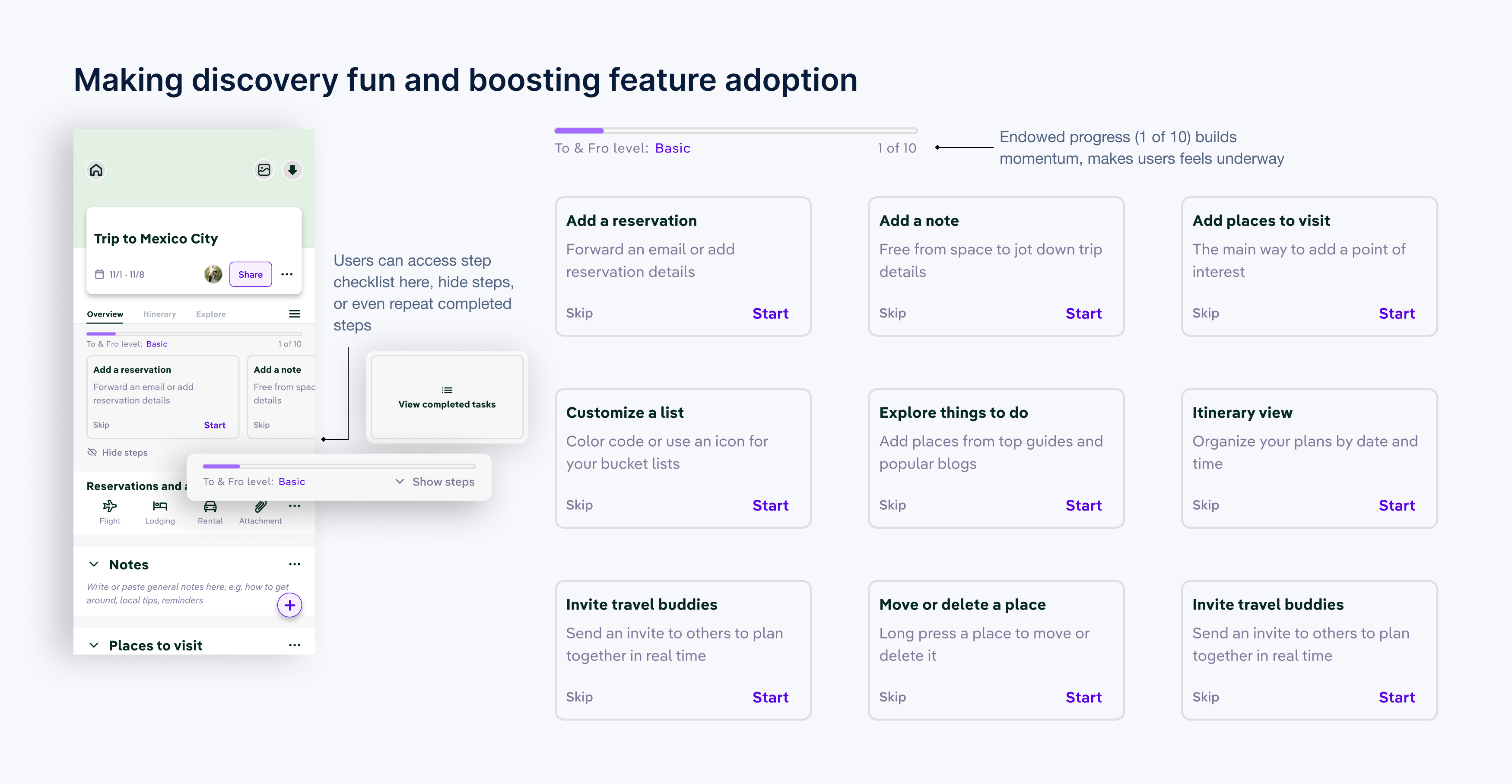
New onboarding checklist
After signup, users were greeted with a four-task onboarding checklist.

Each task was designed to be completed in under five minutes, helping users feel progress immediately.

Small cues embedded in the product nudged users toward high-value features naturally, supporting a smooth and engaging learning curve.

V. Validate

Initial impressions and results were mostly positive

Positive reception
Round-one testing showed users could locate key tools and, with guided onboarding, quickly grasp the app’s value for simplifying trip planning.

However...

... We ran into another issue

Itinerary creation wasn't obvious
Usability sessions still showed friction at the moment of truth: I made an account... now what?

People weren’t sure how days, lists, and places related, or how to tell if the plan was usable (distance, time).

"Uh... How does itinerary work?"
- user

So we addressed that problem

Itinerary tutorial
Because this was a new tool and early users weren’t sure how to start an itinerary, I added a dissmissible coach-mark sequence that appears the first time someone opens Itinerary with an empty plan.
Gamifying the experience
I introduced a progress meter and a ten-step checklist, pre-ticking the first task. That small head start (‘endowed progress’) builds momentum—users feel underway, complete the remaining steps, and learn the itinerary model as they go. The checklist turns onboarding into a guided tour, making discovery fun and boosting feature adoption.

Evaluate — how we measured impact (and how we’d scale it)

Primary KPIs
Onboarding completeion: signup start → checklist done (or first place added as the "value" proxy)

Time-to-value (TTV): median minutes from account created → (create trip OR first place added)

Qualitative validation: 5-7 follow-ups focused on "first itinerary" comprehension: can users explain the model and build a first day unaided?
Study design
Baseline vs post cohort comparison (same acquisition mix, 14-day windows)
Accomplishments
Initial testing projected the following metrics:

40% decrease

in time to value

70% increase

in onboarding completion rates

4/5 rating

by users for ease of use

Conclusion

Measuring success after 90 days
If the onboarding had shipped during my time, I would have measured success by:

• Comparing conversion rates between users who completed vs. skipped the checklist

• Tracking activation and adoption rates for key features

• Monitor churn over 30/60/90 days

• Collect qualitative feedback through in-app surveys and interviews

Over time, refining based on behavior patterns would be critical to long-term success.

What I learned

Takeaways
• Guide, don’t overwhelm: A small, meaningful checklist builds early momentum better than a flood of options.

First impressions matter: Users judge credibility in seconds — a modern, seamless sign-up experience is essential.

Speed to value wins loyalty: Helping users succeed quickly keeps them engaged longer.

Flexibility respects users: Giving users control (e.g., skip options) builds trust.